Repositioning market leading care homes products provider
Who are Acticare?
Acticare is a family-owned business with nearly two decades of experience supplying over 3,000 essential products to care homes across England and Wales. Founded in 2006, Acticare has built a strong reputation for its unwavering commitment to care, service, and support.
What sets them apart is their deep understanding of the unique needs of care homes, ensuring that these businesses can deliver the highest quality of care while providing a dignified and fulfilling later-life experience for residents. At the same time, they help care homes balance the challenge of operating efficiently as successful businesses in a competitive sector.
The Brief
In 2023, Acticare got in touch as they prepared to celebrate a pivotal moment in their company’s journey – nearly 20 years of growth and a record-breaking year in sales. As part of their long-term vision, they sought a bold and dynamic rebrand that would not only reflect their current success but also position them for future expansion, with ambitious plans already set in motion for 2025 and beyond.
Branding
Packaging
Objectives
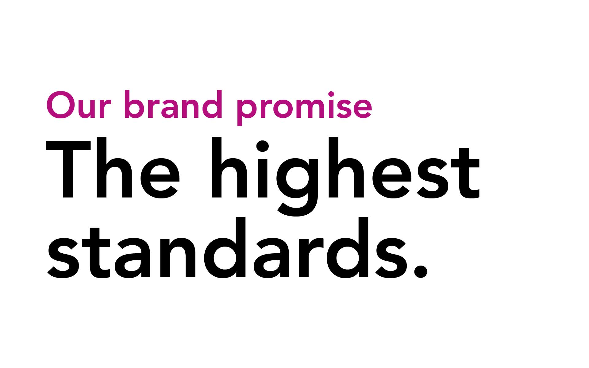
The rebrand required more than just a visual refresh; it needed to convey their evolving brand promise, reaffirm their core values, and clearly articulate their distinct market positioning. The brief included an updated logo, new visual assets, and a compelling narrative that would resonate with both long-standing clients and new audiences, highlighting Acticare’s continued dedication to improving care environments.
A key objective of the project was to launch the core rebranded own label range and new web shop, developing an effective strapline to support the updated Acticare brand.
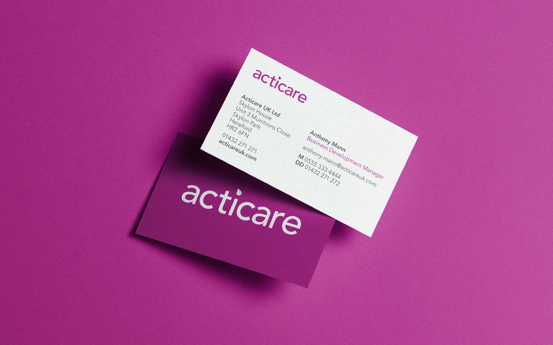
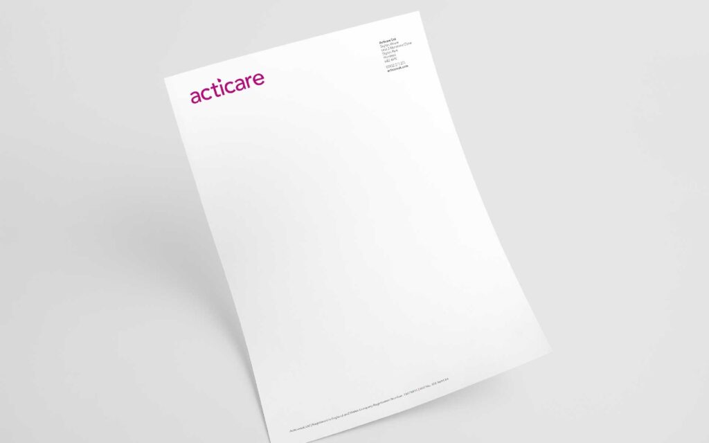
An essential part of any branding project, we needed to create a set of brand guidelines to allow the brand to be brought to life consistently across all key online and offline collateral, signage and infrastructure.
Key considerations for us in the process, were ensuring that the new brand identity effectively communicated the attention to quality and detail that Acticare represents. It needed to reinforce key values and aspirations of a wide range of clients, creating a hierarchy of messaging to resonate with different roles and appropriate services.
Vital insights
The project began with meetings with key stakeholders, marking the start of our research process. We visited the Acticare offices and chatted to every team, gathering invaluable feedback.
We learned that the current brand already held strong equity—people felt that Acticare consistently went ‘above and beyond,’ and that this formed a key part of their service proposition.
However, constructive feedback highlighted that the brand was not memorable enough, a key necessity in a busy and competitive marketplace.
Opportunities were particularly evident in the branding of livery and packaging. Delivery vans were left plain, missing chances for recognition, and the packaging was inconsistent across products. While the brand was already vibrant, the individual elements didn’t come together to create a seamless experience.
The sales and customer service teams also felt they lacked a cohesive suite of tools for engaging potential customers, which limited their ability to communicate the brand effectively.
Our approach
Stakeholder engagement & research – We conducted interviews with all key stakeholders, visiting offices and speaking with every team. This confirmed the strengths of the existing brand, particularly the strong internal belief in Acticare’s values, and helped identify opportunities for greater memorability and cohesion.
Visual identity refresh –
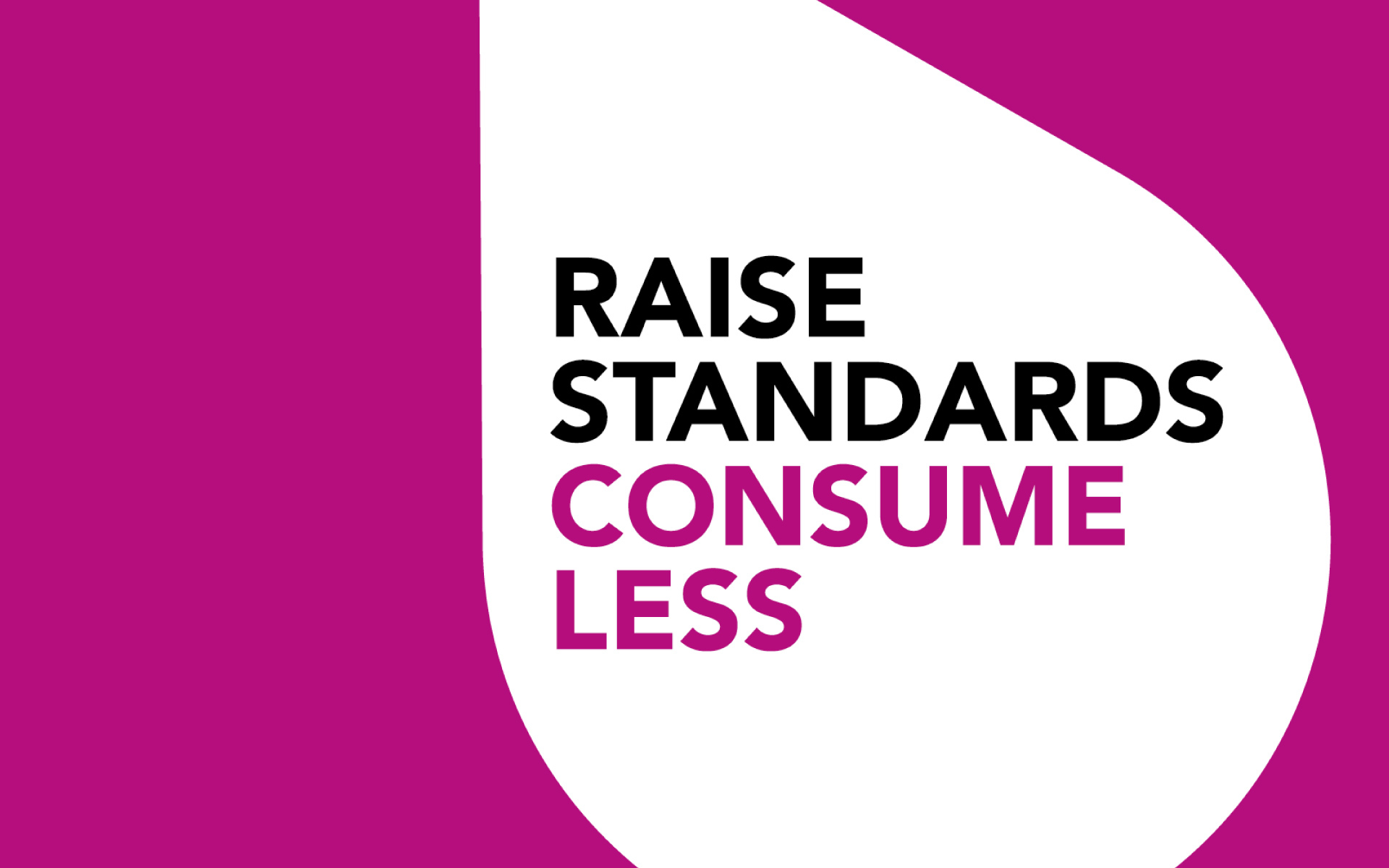
Droplet motif: We brought the droplet front and centre, turning it into a key device for messaging and brand recognition.
Colour palette: Brand colours were subtly refreshed, creating a fresher, more vibrant feel while maintaining familiarity.
Packaging design: Sustainability was prioritised with single-colour print and the bold droplet prominently displayed, ensuring impact and memorability.
Strapline and Messaging – We worked heavily on the strapline, carefully considering content, positioning, and presentation. Once finalised, it was applied across all collateral, becoming central to how the team communicated with clients and each other. Keeping it front and centre was key to building memorability in a competitive market.
Bringing the brand to life
The refreshed identity and strapline were implemented across every touchpoint – from delivery vans and product packaging to digital assets and office signage – ensuring a seamless, cohesive brand experience.
Sales and customer service teams now had a suite of tools that effectively supported their interactions and reinforced Acticare’s values and quality.
“
“A clean, vibrant brand which displays our energy and quality was the brief, and wow you’ve delivered on it!”
Josh Boyman, Managing Director at Acticare
A strong outcome
The rebrand has positioned Acticare as a vibrant, professional, and memorable brand in the care sector. By bringing the droplet to the forefront, refining the visual identity, and embedding a strong, clear strapline, we reinforced Acticare’s attention to detail and commitment to care.
The project strengthened internal cohesion, provided effective sales tools, and ensured that every client touchpoint reflects Acticare’s energy, quality, and dedication – helping them stand out in a competitive market while remaining true to the values that have guided the business for nearly two decades.